Category: Digital experience

  • Why we use WordPress and Astro to build better websites

    Why we use WordPress and Astro to build better websites

    WordPress and Astro can build better websites when each takes on the role it is best suited to.

    For a long time, building a website meant writing it by hand. HTML, CSS, PHP and JavaScript gave us direct control over every page and every detail. But they also made even small editorial changes dependent on a developer.

    When WordPress evolved, it solved a real problem. Clients could manage their own content. They could publish an article, update a service, add an image or correct a detail without waiting for us. That autonomy still matters.

    Then came page builders. We worked with WPBakery and moved early to Elementor. The promise was understandable: set up a library of well-designed components, give clients more freedom and make page creation easier.

    In practice, most clients did not want to become web designers. They wanted to manage their content and keep control of their data. When a new page, a more considered layout or an important change was needed, they still preferred to work with us.

    When one system has to do everything

    WordPress can be a very good editorial tool. The difficulty starts when the same installation is expected to manage content, define every visual layout, run a growing plugin stack and generate every public page on every visit.

    Over time, that can make a website heavier than it needs to be. Page builders and plugins are not automatically a problem, but a frontend built through years of additions often delivers more code, styles and scripts than a page actually needs.

    The result is harder to maintain and harder to improve deliberately. That matters because the public website should be focused. It should load cleanly, communicate clearly and reflect the quality of the organisation behind it.

    We kept WordPress. We changed its role.

    Today, we still use WordPress for many projects. It remains a familiar and practical place for clients to manage pages, articles, media, team profiles, services and structured content.

    The public-facing website is built separately with Astro. This is a headless setup: WordPress is the editorial backend, while Astro is responsible for the frontend visitors see.

    That separation is useful because each part can do its job properly.

    • WordPress gives editors a clear place to manage content
    • Custom post types and fields keep recurring content structured
    • Astro gives us precise control over layout, performance and code sent to the browser
    • The frontend can be built around the project rather than around a generic theme

    Most pages do not need to be generated on every visit

    Some website features need to be dynamic: a client portal, real-time availability, a checkout or personalised data. But most pages on an organisation’s website do not change every minute.

    A service page, a case study or an article can usually be generated when the site is deployed or updated. Astro allows us to do that while keeping dynamic behaviour for the parts that genuinely need it.

    Instead of treating the whole website as a live application, we decide what needs to be live. That creates a leaner public output and gives us more control over performance, image handling, metadata, structured data and the technical foundations of SEO.

    Autonomy without turning the website into a design tool

    A headless setup does not take control away from clients. It makes that control more useful. Clients can still manage their content, media, SEO fields and structured information. We define the editing experience around what their team actually needs to maintain.

    Some areas need freedom. Others need structure so the visual identity and the user experience remain coherent over time. Giving every editor unlimited layout control is rarely the same thing as giving them autonomy.

    A practical choice, not a fashionable one

    We do not use the same stack for every project. A small campaign page, a temporary site or a project with limited editorial needs may call for a simpler solution. The right architecture depends on the organisation, its content, its internal team and the role the website has to play.

    But when a client needs a website that is easy to manage, visually precise and technically controlled, WordPress and Astro are a strong combination. WordPress remains the editorial workspace. Astro becomes the public-facing website.

    That lets us keep what clients value about WordPress while building a cleaner frontend from the ground up.
  • When WordPress becomes a bottleneck for your website

    When WordPress becomes a bottleneck for your website

    When WordPress slows down your website, the problem is usually not WordPress on its own.

    WordPress is not automatically slow. It is also not automatically the wrong choice for a modern website.

    It is widely used for good reasons. Editors know it. It is flexible. It can manage pages, articles, media, forms and structured content. For many organisations, it remains a practical part of the digital ecosystem.

    The issue is usually not WordPress itself. It is what happens when one WordPress installation gradually becomes responsible for everything.

    The gradual build-up of complexity

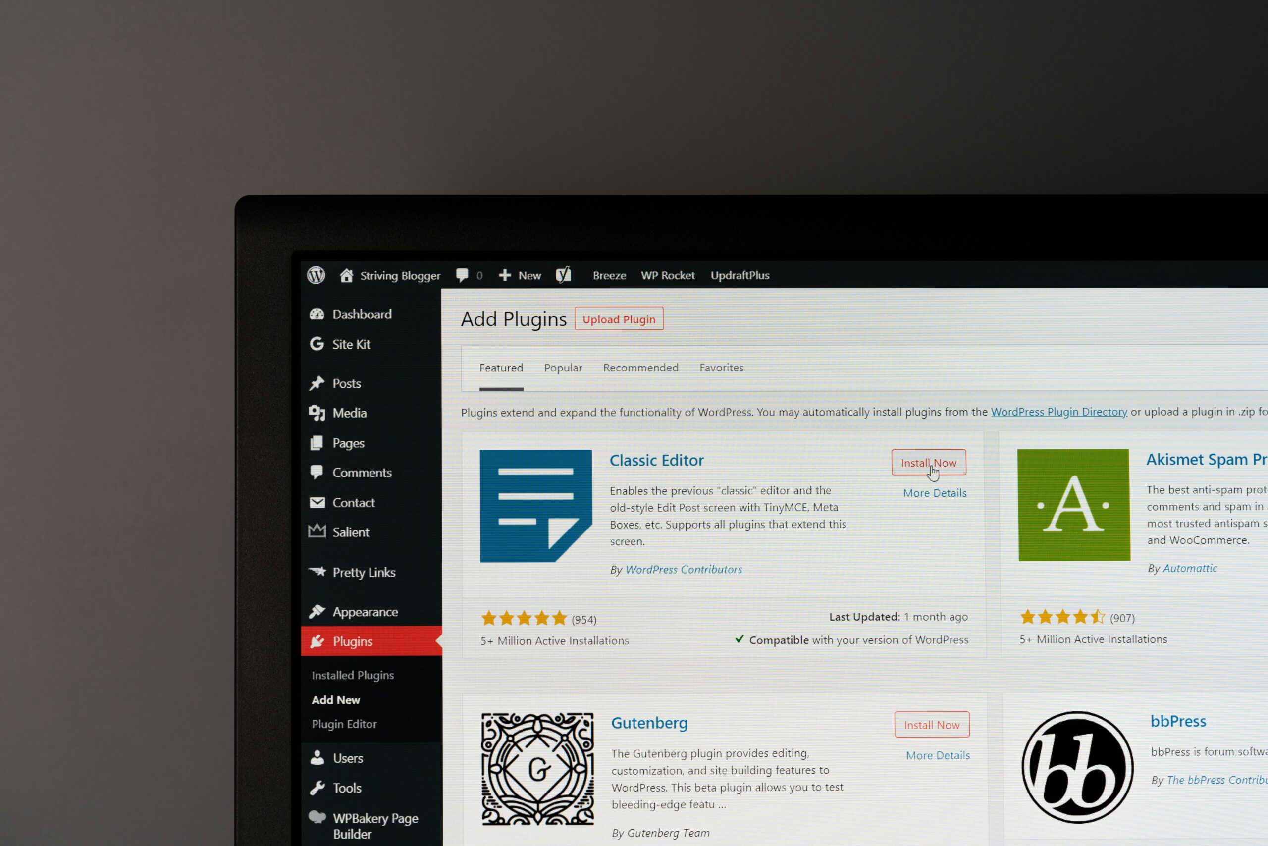
    A website often starts simply. A theme is installed. A page builder is added. A form plugin, an SEO plugin, a cookie banner, a slider, an optimisation plugin and a few integrations follow. Each choice can be reasonable on its own.

    After several years, however, the website may carry a long history of decisions. Some plugins overlap. Some are no longer used. Some are required only because another plugin or a theme depends on them. The frontend may load scripts and styles for features that are not used on the page a visitor is viewing.

    That is when the website becomes harder to reason about. A small change can have unexpected effects. Improving performance becomes an exercise in working around accumulated layers instead of improving the structure at its source.

    Signs that the current setup is holding the website back

    • Pages are difficult to keep fast despite caching and optimisation plugins
    • Editors are unsure which components are safe to use
    • The design system slowly drifts as pages are assembled differently
    • Important updates require workarounds because the theme or builder has become restrictive
    • Several plugins exist for functions that should be part of the content model or frontend
    • It is difficult to explain what the website actually needs in order to run

    None of these signs means the site needs to be rebuilt immediately. They do mean that a technical review is worth having before the next redesign or content expansion.

    Content management and frontend delivery are different jobs

    Clients need an interface where they can manage their content. Visitors need a website that loads only what the page requires. Those are related needs, but they do not have to be solved by the same layer of the stack.

    In a headless setup, WordPress remains the content management system. It can still hold custom post types, fields, media, editorial workflows and SEO data. The frontend is built separately, for example with Astro.

    That means we can keep the familiar editing experience while reducing the amount of generic code and dependency logic that reaches the public website.

    Page builders solved a real need

    It is easy to criticise page builders in hindsight. That would miss the point. They helped many organisations move away from websites that could only be edited by developers. They made layout tools more accessible and gave teams a way to work with reusable blocks.

    But the kind of flexibility they offer is not equally useful for every organisation. Most teams do not need to design a page from a blank canvas. They need a dependable set of content structures that preserve the visual system and let them make the right updates quickly.

    That is a different form of autonomy. It is more constrained, but often more useful in practice.

    What to do before deciding on a rebuild

    Start with the actual problem. Is it performance, editorial workflow, visual inconsistency, security, maintainability or a combination of several issues?

    Then separate what needs to stay from what needs to change. Your existing content, WordPress familiarity and structured data may all be worth preserving. The public frontend, the plugin stack and the way pages are delivered may be the parts that need a different approach.

    A good rebuild is not a reaction to a trend. It is a chance to simplify the system around the organisation’s real needs.

  • Static vs dynamic websites: what actually needs to be live?

    Static vs dynamic websites: what actually needs to be live?

    Static vs dynamic websites are not a final either-or choice: it depends on what truly needs to stay live.

    The phrase “static website” can sound outdated. It suggests a site that cannot change, cannot be edited and cannot do anything beyond displaying a few pages.

    That is not what static means today.

    A modern static website can be connected to a CMS, use structured content, optimise images, include forms and keep selected features dynamic. The difference is simply that pages which do not need live computation are generated in advance rather than assembled from scratch every time somebody visits.

    Dynamic is useful when the information changes in real time

    Some parts of a website need to respond to live data or individual users. A client portal, an online booking system, a product stock level, a checkout flow or a dashboard cannot be prepared once and left unchanged.

    Those features need a dynamic system. The server or application has to generate the right response at the moment it is requested.

    But a large part of a typical organisation’s website is different. Service pages, team profiles, case studies, articles and contact information are usually updated occasionally, not every second.

    Most marketing pages are predictable

    When a visitor opens an about page, there is rarely a good reason to make the server rebuild that page in real time. The content can be generated when the site is deployed, then delivered as a prepared page.

    This has practical benefits. The visitor receives a more direct response. The website can be easier to cache and protect. The frontend can contain only the code and assets required for the page.

    It also gives us a useful design discipline: instead of adding a runtime layer by default, we ask whether the feature actually needs one.

    The right question is not static or dynamic

    In many projects, the best answer is both.

    The editorial pages can be generated in advance. A form can still submit to a secure endpoint. A search experience can use a targeted service. A booking widget can remain dynamic. Interactive elements can be added where they genuinely improve the experience.

    The point is to make each decision deliberately. A website should not carry the cost and complexity of a fully dynamic application just because one part of it needs to react in real time.

    How this works with WordPress

    WordPress can remain the place where content is written and managed. When content changes, the website is rebuilt with the new data. The next visitor sees the updated page, but does not need WordPress, the database and the editing interface to be involved in every page view.

    For the client, the editorial process remains familiar. For the visitor, the public website can be leaner and more focused.

    This model also makes it easier to set clear boundaries. WordPress is responsible for content. The frontend is responsible for delivery. Dynamic services are used only where they are needed.

    It is not about technical purity

    There is no virtue in making a feature static when it needs to be live. Equally, there is no benefit in making every page dynamic by default.

    The right architecture comes from understanding how the organisation works, what the visitor needs and what the team will need to maintain after launch.

    For many brand and marketing websites, a static-first frontend with selected dynamic features gives the best balance: editorial freedom, technical control and a more considered visitor experience.

  • How to choose a CMS without making your website heavier

    How to choose a CMS without making your website heavier

    To choose a CMS without making your website heavier, start with the way your team actually works.

    Choosing a CMS is often treated as a technical decision. It is not only that.

    A content management system affects who can update the website, how content is structured, what can be maintained internally and how much technical complexity the organisation takes on over time.

    That is why the right question is not “Which CMS is best?” It is “Which CMS fits the way this organisation needs to work?”

    Choose a CMS by starting with the people who will use it

    Before comparing platforms, look at the editorial reality. Who will publish content? How often will they do it? Are they comfortable working with structured fields, or do they need a very simple interface? Does the team need to create new types of content, or mainly update existing pages?

    A CMS should make these tasks clearer, not introduce a new technical responsibility for the people who use it.

    For many organisations, WordPress remains a sensible choice because it is familiar and flexible. It can support pages, articles, projects, services and custom content models without requiring the whole team to learn a new environment.

    Do not confuse content freedom with layout freedom

    There is a difference between being able to update content and being able to redesign a page.

    Most clients need to change titles, text, images, links and structured information. They may also need to add an article, a case study or a team member. These are editorial tasks.

    Giving every editor unrestricted layout control can look empowering, but it can also make a website harder to keep consistent. The visual system slowly shifts. Components are used in unintended ways. Important pages lose the structure that made them easy to read.

    A good CMS setup gives people the freedom they need while protecting the parts that should remain coherent.

    Define the content model before selecting plugins

    Many websites become complex because the content model is never made explicit. A new need appears, a plugin is installed, then another exception is added later.

    It is usually better to begin with the recurring content types. What does the organisation need to manage repeatedly? Services, projects, people, articles, events, locations, resources or testimonials?

    Once this is clear, those things can be represented as structured content. That makes editing easier and gives the frontend reliable information to work with.

    Consider the public website separately

    A CMS is the place where content is managed. It does not have to dictate how every public page is delivered.

    In a headless setup, WordPress can remain the editorial backend while a dedicated frontend such as Astro handles the website itself. This is useful when performance, visual precision, multilingual delivery or long-term frontend control are important.

    It allows us to preserve a familiar CMS without forcing the public website to carry the full technical weight of the backend, theme and page-builder layer.

    Ask practical questions before making a decision

    • Who needs to edit the website and what do they need to change?
    • Which content should be structured rather than created as one-off pages?
    • Which integrations are essential and which are only nice to have?
    • Does the website need to support several languages?
    • Which parts need to be dynamic in real time?
    • How will the system remain understandable after launch?

    These questions lead to better decisions than choosing a platform because it is familiar, fashionable or recommended in a generic comparison article.

    The CMS should serve the website, not burden it

    The goal is not to use the newest tool or build the most technical stack. The goal is to give the organisation a dependable editorial system and a website that remains clear, fast and maintainable.

    For many projects, that means keeping WordPress for content management and using a separate frontend for the public experience. For others, a simpler setup may be enough.

    What matters is that the technology supports the work. It should help the team manage content, help visitors understand the organisation and give the website room to evolve without becoming unnecessarily heavy.

  • Why we separate your CMS from your public website

    Why we separate your CMS from your public website

    To separate your CMS from your public website is to create a clearer boundary between content management and public delivery.

    Website security is often discussed as a list of tools: updates, passwords, backups, plugins and a firewall. All of those matter. But the architecture of a website matters too.

    When a traditional WordPress site serves its public pages, WordPress, PHP, the database, the theme and installed plugins are involved in the delivery path. They need to work correctly every time a visitor opens a page.

    In a headless setup, WordPress still manages content, but the public website is generated separately and delivered as static files. That does not make a website invulnerable. It does create a clearer boundary between the editorial system and the public frontend.

    Reducing exposure is different from removing risk

    WordPress remains a system that must be maintained. Core, plugins and themes need updates. Editor accounts need sensible permissions. Unused plugins should be removed. Backups need to be tested. The CMS itself must be protected as a serious operational system.

    But a static public frontend does not need to execute WordPress or PHP for every page view. The public website can serve the last approved build without asking the CMS to generate each visit in real time.

    This reduces the number of moving parts exposed through normal public browsing. It also means that an issue affecting the CMS does not automatically become an issue affecting every public page.

    What can stay online during a CMS incident

    If the CMS becomes unavailable, the public frontend may continue to serve the most recent safe build. Visitors can still read service pages, case studies and articles while the editorial system is investigated and restored.

    That is useful for continuity, but it is not a guarantee. The public website still depends on its hosting, DNS, CDN, deployment process, media delivery and any interactive services it uses. A compromised CMS must also be treated as an incident: access needs to be reviewed, credentials may need to be rotated, and restored data needs to be checked before a new build is deployed.

    The benefit is not that security work disappears. The benefit is that the impact can be contained more clearly.

    Where Cloudflare fits

    Cloudflare is part of that boundary. It can manage DNS and sit in front of public services as an edge layer. Used properly, it can apply targeted web application firewall rules, rate limits, bot protections and caching before a request reaches the origin.

    For a public marketing website, this can help reduce unwanted traffic and protect common sensitive paths. For a CMS, the policy should be stricter. The administration area, login routes, API endpoints, deployment hooks and other operational services should not be treated like ordinary public pages.

    Cloudflare is not a substitute for updating WordPress or reviewing plugins. It is one layer in a wider approach: a maintained CMS, limited access, tested backups, a protected origin, an intentional deployment process and a public frontend with fewer runtime dependencies.

    Security is also an operational question

    The most useful security decisions are often the least visible. They reduce unnecessary dependencies, separate public and administrative surfaces, make recovery more predictable and avoid giving one incident more reach than it needs.

    That is why we separate the CMS from the public website when the project calls for it. It gives editors a familiar place to work while allowing the public experience to remain focused, fast and less dependent on the CMS being available for every request.

  • Why we use less JavaScript when building websites

    Why we use less JavaScript when building websites

    To use less JavaScript on your website often means delivering a simpler, more robust experience.

    Not every website interaction needs JavaScript. That may sound obvious, but many websites still load scripts, libraries and components by default before asking whether they are actually needed.

    Our starting point is simpler: use semantic HTML for structure, CSS for presentation and interaction where CSS is the right tool, then add JavaScript only when it creates a real benefit.

    This is not nostalgia for older ways of building websites. Modern CSS can handle far more than it could a few years ago. Transitions, responsive layouts, filters, disclosure patterns and many interface states can now be built cleanly without turning every detail into a client-side application.

    Less JavaScript is a design decision

    Reducing JavaScript is not only about performance. It is about deciding what the website needs to do before deciding which technology to add.

    A simple interaction that works with semantic HTML and CSS is often easier to maintain, easier to test and less likely to fail on a slower connection or an older device. It can also keep the experience more predictable for visitors who use a keyboard, a screen reader or reduced-motion settings.

    JavaScript still has an important place. Some features genuinely need it: complex filters, maps, client portals, live data, enhanced forms or interactions that cannot be expressed properly through native browser behaviour. The point is not to avoid it. The point is to make it earn its place.

    Start with the page the visitor receives

    When we build a static-first frontend, the first version of the page is already useful HTML. The structure, headings, content and links are available before extra client-side behaviour is added.

    This gives us a clearer base for accessibility and SEO. It also makes it easier to see what every page is actually sending to the browser. A page should not carry a large interface framework, animation library or tracking stack simply because one small part of it is interactive.

    Performance is more than a score

    Performance tools are useful because they reveal problems: heavy images, unnecessary scripts, blocking resources or unstable page layout. But a score is not the objective by itself.

    The objective is a website that feels direct and dependable. Images and videos should be delivered at an appropriate size. Non-essential scripts should not block the first page view. Interactions should feel intentional rather than decorative. The page should remain understandable before everything has loaded.

    Accessibility and consent belong in the build

    Accessibility is not something added after the interface is finished. It starts with meaningful HTML, logical headings, keyboard behaviour, clear labels, sufficient contrast and a design that does not depend on one specific way of using a device.

    The same applies to consent and tracking. A cookie banner is not a decorative legal layer. It needs to control when non-essential tracking technologies are activated. The implementation should make that behaviour visible and testable.

    A lean frontend does not guarantee accessibility or compliance. It makes the system easier to inspect, test and improve because fewer hidden layers are working against the page.

    Technical quality is built through choices

    We use tools to test accessibility, performance, SEO and page quality. Those checks are useful, but they do not replace judgement. A high score does not automatically make a website clear, accessible or effective.

    What matters is the discipline behind the result: choosing the smallest useful solution, handling media carefully, respecting browser standards, adding code for a reason and testing the delivered website rather than trusting the source alone.

  • Is a compliant website really accessible?

    Is a compliant website really accessible?

    I still often see accessibility treated as a final step: an audit is commissioned, the reported issues are fixed, and the website is then considered accessible. That is a good start. But, for me, it is not enough proof.

    A website can meet a large proportion of the WCAG success criteria and still be frustrating, confusing or impossible to use for a disabled person. When I work on a website, I am interested in a more practical question: can someone find the information, understand what is expected of them and complete what they came to do without having to ask for help?

    That distinction guides how I approach accessible website design. Standards provide an essential framework. But they cannot replace observing how people actually use a service.

    Accessible website design: why I do not stop at WCAG compliance

    The WCAG have given teams, organisations and regulators a shared language. They provide specific reference points: text alternatives, keyboard navigation, contrast, heading structure, error messages, focus states and text resizing. Without that framework, everyone would decide for themselves what is acceptable.

    So I do not set them against user experience. On the contrary, they are the foundation I aim to build in from the design stage. But a standard checks conditions. It cannot, by itself, experience an entire user journey.

    An element may be technically keyboard accessible while the tab order remains illogical. Text may be enlarged without the page remaining genuinely readable or usable. A form may follow the markup rules and still leave someone without a clear answer when an error occurs. Compliance is a necessary minimum. It does not automatically guarantee usability.

    What tools and audits do not tell me

    Automated tools are useful. They help identify recurring defects quickly, monitor quality over time and prevent some obvious regressions from reaching production.

    But they read code and rules, not lived situations. They cannot tell whether a button label is ambiguous, a modal provides enough context, form errors are understandable, or someone can actually complete a task with the tools they normally use.

    That is why I do not limit the question to, “does the page pass?”. The useful question is: “can someone complete the action that matters without relying on outside help?”

    The ways of using a service that I try not to overlook

    When people discuss accessibility, they often first think of blind and partially sighted people. That is essential, but the subject is broader. An interface can also create barriers for deaf and hard-of-hearing people, people with reduced mobility, cognitive or learning difficulties, or people who use assistive technologies.

    I also try not to reduce the issue to permanent situations. Someone with an arm in a cast, a parent holding a child, or a person looking at their phone in noise or bright sunlight may encounter a context-related barrier. That does not minimise disability. It is a reminder that a service designed for different ways of using it is usually more robust for everyone.

    In practice, this means not depending on a single gesture, sense or speed of interaction. An important action should be possible with a keyboard as well as a pointer, with understandable labels, sufficient time and clear feedback about what has just happened.

    Movement should help, not demand attention

    I am not trying to remove every animation. A transition can explain that a panel has opened or that a form has been submitted. But continuous, automatic or decorative movement can distract from the task and make concentration more difficult for some people.

    The prefers-reduced-motion system preference makes it possible to offer a calmer version to someone who has chosen to reduce animations on their device. For me, the right question is simple: does this movement help someone understand, or does it demand attention without providing useful information?

    I test a journey, not just a page

    For an organisation, the useful question is rarely, “is our website accessible?”. I prefer to ask: can someone actually complete the tasks that matter? Find important information, compare an offer, contact the organisation, fill in and correct a form, book, pay or follow up a request.

    This approach exposes what an isolated page can easily hide: implicit instructions, poorly announced changes of context, vague buttons, errors that are hard to correct, or steps that depend on visual information alone.

    Testing with disabled people can reveal these barriers in very concrete ways. It does not replace a serious WCAG assessment, just as a single person’s feedback cannot represent every way of using a service. The W3C recommends combining the involvement of people concerned with conformance evaluation. That combination seems the most honest approach to me.

    Why I prefer to discuss cost at the start of a project

    Taking accessibility seriously takes time, skills and sometimes a dedicated budget. Building robust components, reviewing content, testing with a keyboard, fixing forms and checking critical journeys are part of the work. Bringing in an independent body for an audit, or organising tests with disabled people, also adds a cost.

    I prefer to say that from the outset rather than presenting accessibility as an easy option to add at the end. An independent audit, such as those offered by AnySurfer, is a paid expert assessment service. Usability testing has a separate budget: scenarios must be prepared, participants recruited and paid, sessions facilitated, findings analysed and then addressed.

    That does not mean every website must immediately fund a label or a full user study. The appropriate level of effort depends on the service, its audience, the risks and the applicable obligations. But the choice should be deliberate. Leaving the issue until the end often means discovering structural problems when they are more expensive to fix.

    In Belgium, digital accessibility is already a legal obligation for public-sector services. Since 28 June 2025, some consumer-facing private services, including e-commerce, have also been covered by new European requirements. These obligations do not simply depend on the size of a business: they depend on the service offered and the intended audience. The Federal Public Service Economy guidance explains, among other things, the framework that applies to e-commerce in Belgium.

    What I take from WCAG and AnySurfer

    WCAG 2.2 remains a very useful quality baseline today. The work under way on WCAG 3 also points to an interesting shift: more attention to users’ functional needs and the outcomes they need to achieve, rather than only a list of technical checks.

    I also value AnySurfer’s approach in Belgium because it connects the skills of the teams, the quality of the delivered product and the client’s ability to maintain that quality over time. An interface does not stay accessible by magic once it is live. Content changes, new features appear and teams change.

    In 2023, I completed AnySurfer’s Web accessibility training for developers. Not to present myself as an all-knowing expert, but to better understand my responsibilities as a developer and keep improving my practice.

    How I approach accessibility at Fauves

    I do not see accessibility as a perfect state that can be reached once and for all. It is ongoing attention: checking, correcting, learning and doing better at every stage.

    • Define the critical journeys. Identify the tasks that must not leave anyone behind.
    • Design with accessible principles. Plan robust components, understandable content, visible states and consistent navigation.
    • Check regularly. Combine manual review, automated tests and checks against the relevant WCAG criteria.
    • Test when the project warrants it. Observe concrete tasks with people concerned and incorporate their feedback early enough to make changes.
    • Maintain quality. Train the people who publish content, document decisions and recheck changes to the website.

    At Fauves, I want to keep making this approach more concrete, more verifiable and more sustainable, including by starting the steps needed to obtain an AnySurfer label.

    Key takeaway

    A compliant website is better than a non-compliant one. But a genuinely accessible website is not judged by its code compliance alone. It is judged by whether people, in all their diversity, can understand, navigate and take action without encountering unnecessary barriers.

    Standards point the way. The people concerned tell us whether we have got there.